 KieferArt
|
Currently, I am working with a method used at the Art Students League in NY. It was first introduced to me in an intensive workshop conducted by David A. Leffel, who taught at the school for many years. I suppose I didn't have an official method before that, mostly using value (light and dark) to create dimension. After expending a good amount of mental energy thrashing around these new concepts, I discovered how powerful yet simple this idea was and what a huge difference it was making to the overall look of my work. The basic premise is that the parts of objects receiving light are what we notice as we observe them in life. The parts in shadow are simply "place markers". To manifest this idea, if the light source is optically cool (e.g., a cloudy day), shadowed areas are indicated by using flat, warm, transparent colors. This sets a convention within the work establishing those areas as "space", marking the contextual environment for the more animated lit parts of objects. |
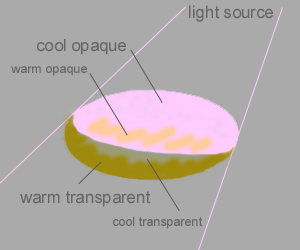 |
Cool, opaque colors are used to indicate whatever parts of your subject are in light. Those lit areas will then appear "solid" by comparison. (Sometimes it may be difficult to determine if a particular color is warm/cool or transparent/opague. The oil colors are manufactured to optically fall into one category or the other, though. If in doubt, listings of paint qualities may be found online, e.g. www.gamblincolors.com. The paint is then separated on the palette based on those qualities.) The contrast of "temperature" and pigment concentration is the key to creating dimension on canvas. So, referring to the diagram, if the subject is receiving light from above right, the lit part of it would be painted an opaque, cool color and its shadowed areas would be transparent and warm. To give the lit area dimension, the part closest to you is painted warm (same value). The part closest to you in shadow would be cool. |
Piece of cake, right? I learned this in 2002 and still struggle with it, but it is truly worth the effort. Cast shadows are treated with the same contrasting temperatures. Reflected light is a bit more complex to incorporate, but even then, after working with the warm/cool scheme within your piece, you'll instinctively know how to handle it. For more info on this method, you can reference the many books, videos and DVDs by Art Students League alumni who use this method. I am also planning to offer some form of a tutorial on this website in the near future. In the meantime, the comments that accompany each of my paintings in the Kieferart Fine Art Gallery contain quite a lot of information. |
HOME |
INTRODUCTION |
FINE ART GALLERY |
PORTRAIT GALLERY |
COMMISSION INFO & PRICING |
CARDS/WRITING |
LESSONS |
WHAT'S NEW AT KIEFERART |
KIEFER
© 2011 - 2013 Oil Painting by Kiefer All Rights Reserved.
Website developed by Karen Kiefer. Inquire within.
© 2011 - 2013 Oil Painting by Kiefer All Rights Reserved.
Website developed by Karen Kiefer. Inquire within.